
UI/UX design for products people find easy to use
Interfaces for web apps, mobile apps and business software, designed from evidence about the people who use them — so the product makes sense on first use and the team building it knows exactly what to build.
User research, UX audits, flows, wireframes, prototypes, interface design, design systems and usability testing, from a technology company whose designers work beside its developers.
Practices and services
What UI/UX design is, and why it comes first
UX is the structure and flow of a product — what happens, in what order and why. UI is the visual and interactive layer on top of it. A product needs both, and most usability problems trace back to the structure rather than the surface.
- Research before design Interviews, analytics and support tickets show where users get stuck and what they are trying to do. The amount of research matches the risk: a new product needs more than a single screen.
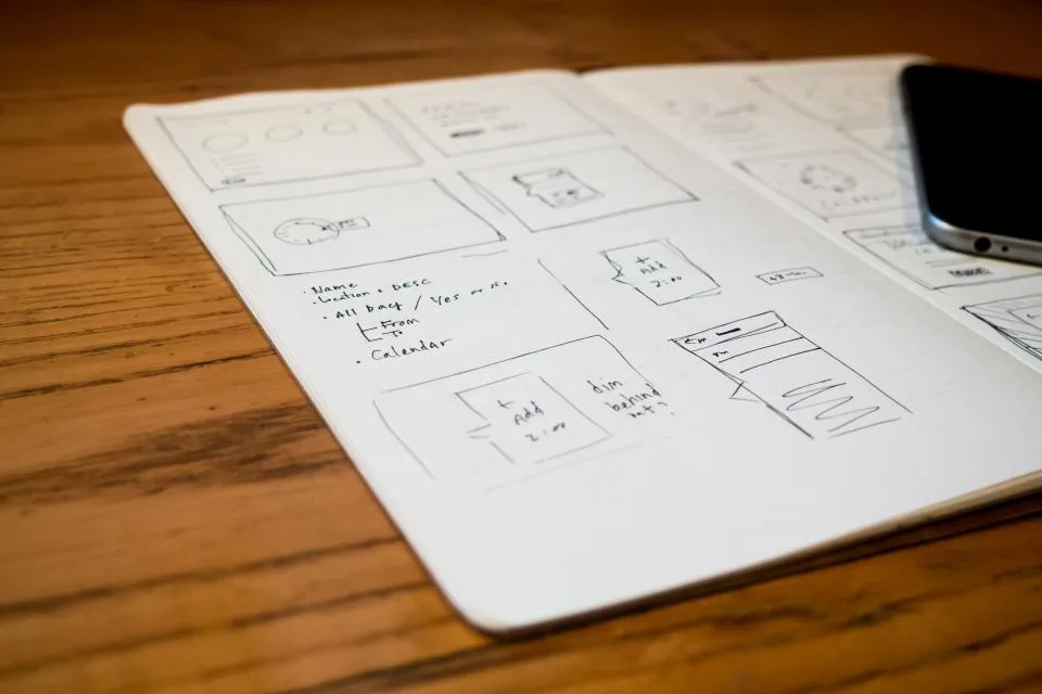
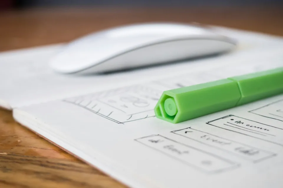
- Structure, then surface Information architecture, user flows and wireframes settle what each screen is for before any visual design. Changing a box on a wireframe costs minutes; changing a built feature costs a sprint.
- Tested with real users Clickable prototypes put in front of the people who will use the product, so problems are found while they are still cheap to fix rather than after release.
- Designed to be built A design system of components, states and rules, handed over in a form developers can build from directly — and reviewed against the build so what ships matches what was designed.
Business challenges we solve
Six reasons product teams and founders come to us about design — before a first release, or after one that users found harder than anyone expected.
Users drop off part-way through
Sign-up, onboarding or checkout loses people at the same step every time, and nobody is sure whether the problem is the screen, the wording or the order.
Support tickets about how things work
Customers keep asking how to do things the product already does, because the features are there but impossible to find.
A product that grew screen by screen
Years of features added one at a time have left inconsistent buttons, layouts and patterns, so every screen feels like a different product.
Developers designing on the fly
Without complete designs, engineers guess at states, spacing and edge cases, and every guess becomes a rework ticket later.
Building before validating
Months of development go into a feature or a product that nobody tested with a user, and the first real feedback arrives after launch.
Internal tools nobody wants to use
Business software that works but is so slow to use that staff keep spreadsheets on the side and the data never reaches the system.
Our UI/UX design services
Five services covering a product's design from first question to shipped interface. They can be taken together for a new product, or one at a time for an existing one.
User research
Evidence about who uses the product, what they are trying to do and where it gets in their way.
Stakeholder and user interviews, analytics and support-ticket review, personas and journey maps.
UX audit
A structured review of an existing product, with problems ranked by how much they cost users and the business.
Heuristic review, flow analysis, accessibility checks and a prioritized list of fixes.
Flows, wireframes and prototypes
The structure of the product worked out and made clickable before anything is built.
Information architecture, user flows, low and high-fidelity wireframes, and interactive prototypes.
UI design and design systems
The finished interface, and the reusable system that keeps it consistent as the product grows.
Visual design, components and their states, design tokens, and documentation of how to use them.
Usability testing and handoff
Designs checked with real users, then handed to developers with nothing left to guess.
Task-based testing, iteration, developer-ready specs and a walkthrough, and review during the build.
The design practices behind every project
Twelve practices across four areas. A small feature might use four of them; a new product uses all twelve, in roughly this order.
Research
Finding out what users need before deciding what to design.
User interviews
Conversations with the people who use, or will use, the product about how they work.
Analytics review
Where users go, where they stop and which features they never find.
Journey mapping
The full path a user takes, including the steps that happen outside the product.
Structure
Deciding what goes where, and in what order.
Information architecture
How content and features are grouped, named and found.
User flows
Each task mapped step by step, including errors, empty states and edge cases.
Wireframes
Screen layouts agreed in low fidelity, so structure is settled before style.
Interface
How the product looks, responds and reads.
Visual UI design
Typography, colour, spacing and imagery applied consistently across every screen.
Interaction design
Hover, focus, loading, error and success states, and the motion between them.
Accessibility
Contrast, target sizes, focus order and labels designed against WCAG 2.2.
Validation and delivery
Proving the design works, then getting it built as designed.
Interactive prototypes
Clickable versions of the product for testing and for stakeholder sign-off.
Usability testing
Real users given real tasks, with what they struggle with fed back into the design.
Design systems and handoff
Components, tokens and specs developers build from, plus review of the build.
Interfaces designed to work in Arabic as well as English
Most interface patterns were designed left to right and in English. These six are what has to change for Arabic-speaking users in the UAE, Saudi Arabia and the rest of the Gulf — and what a product discovers in testing if nobody designed for it.
Mirrored layouts
Navigation, progress steps, carousels and directional icons mirrored for right-to-left, while things like media controls and phone numbers are deliberately left as they are.
Arabic typography in the interface
Arabic and Latin typefaces paired to sit well together, with sizes and line heights adjusted so Arabic stays legible in buttons, tables and small labels.
Mixed-direction content
Screens where Arabic text sits beside English names, codes, email addresses and numbers, designed so the reading order stays clear.
Numbers, dates and currency
Which numerals each screen uses, Gregorian or Hijri dates where users expect them, and AED, SAR and other currencies formatted consistently in both languages.
One design system, two directions
Components and spacing tokens built to flip cleanly between left-to-right and right-to-left, so the Arabic product is not a second design to maintain.
Testing with Arabic-speaking users
Usability sessions run with Arabic-speaking users on the Arabic version, because a layout that tests well in English can still confuse in Arabic.
UI/UX design process
Six stages, in this order, on every design project. The order matters more than the deliverables: each stage settles a question so the next one does not have to reopen it.
-
Discover
We learn the business goals, the users and the constraints, and review what evidence already exists — analytics, support tickets, previous research.
-
Define
The problems worth solving, written down and agreed, with the user flows the design has to support. Nothing is designed before this is settled.
-
Structure and wireframes
Information architecture and low-fidelity wireframes for each flow, reviewed with you and with the developers who will build them.
-
Prototype and test
Clickable prototypes tested with real users on real tasks, then revised where they struggled.
-
Interface and design system
Final visual design for every screen and state, with the components and rules collected into a design system.
-
Handoff and build review
Developer-ready files and a walkthrough, then review of the build against the design so the shipped product matches what was tested.
Why choose Techwaresoft for UI/UX design?
Seven things that follow from being a software company with designers in it, rather than a design studio that stops at the mockups.
Designers who work beside developers
Our designs are checked for feasibility by the engineers who build software every day, so what we hand over can be built as drawn — and if you need it built, the same company can build it.
Research sized to the risk
Enough evidence to decide well, without a study for every screen.
Structure before style
Flows and wireframes are agreed before visual design starts.
Accessible by default
Contrast, focus and labels are part of the design, not an audit at the end.
Systems, not one-off screens
Reusable components that keep the product consistent as it grows.
Arabic and English
A UAE team that designs right-to-left interfaces from the start.
Involved through the build
We review what ships against what was designed and tested.
Trusted by




Design inside a full product launch
Our published case with the most design work in it, though it is a launch rather than a product design engagement: a full brand identity and shoot, and an Odoo site whose menu the catering team edits themselves, for a Dubai company starting from nothing. A UI/UX case study will take its place once a client has approved one.

From ground zero to gourmet — a digital launch for a luxury catering brand
- Challenge
- A Dubai catering company with a premium offline reputation and nothing digital — no website, no identity, no sales assets — on a launch deadline.
- Solution
- An Odoo site with a menu the team edits itself, a full brand identity and shoot, social launch on Instagram, Facebook and TikTok, and hosting behind a WAF and CDN.
- Result
- Within 90 days — a surge in organic and social traffic, and high-value enquiries from event planners and private clients.
- Odoo
- Managed hosting
- Brand & social
Industries we serve
Good interface design follows the same principles everywhere. What changes is who the users are, what they cannot afford to get wrong, and how much they already know.

Technology & SaaS
Onboarding, dashboards and settings designed so trial users reach value before the trial ends.
Talk to us
Startups
A first version designed and tested with users before the build money is spent.
Talk to us
Finance & FinTech
Forms, verification and transaction flows that feel safe and leave no doubt about what happens next.
Talk to us
Healthcare
Booking, records and patient portals usable by people who are unwell, anxious or unfamiliar with technology.
Talk to us
Education
Learning platforms and portals that students, parents and teachers can each find their way around.
Talk to us
Logistics
Driver, warehouse and dispatch apps designed for quick use on a phone, often one-handed and on the move.
Talk to us
Retail & Ecommerce
Product discovery, basket and checkout flows that lose fewer customers between browsing and paying.
Talk to usWhat clients say about working with us
Clients on how the delivery went. The first is about design and user experience specifically: iDrum's founder on the learning platform we built for its students.
Techwaresoft built a learning platform that is intuitive and engaging. The design makes learning drums enjoyable and straightforward, and their attention to user experience really stands out. Our students love the platform.
They built software that truly matched our needs. The team was responsive, detail oriented, and reliable, delivering solutions on time and ensuring the quality exceeded what we had hoped for.
Techwaresoft's staff augmentation transformed our team. Their skilled professionals integrated seamlessly into our projects, bringing reliability, expertise, and efficiency. The team's proactive approach ensured our deadlines were met while elevating overall project quality.
Frequently asked questions
The things product teams and founders ask before starting design work. If yours is not here, it is the fastest thing to answer in a conversation.
What is the difference between UI and UX in practice?
UX is the structure and flow — what happens, in what order, and why. UI is the visual and interactive layer on top. A product needs both, and problems usually trace back to the structure rather than the surface.
Do you work from research or straight to design?
Research first, proportional to the risk. That may be a round of user interviews, or a review of your analytics and support tickets. Designing without evidence is how teams build the wrong thing.
Can you work with our existing design system?
Yes. Where one exists we design within it and extend it where needed. Where one does not, we can establish the components and rules as the work progresses.
Do you hand over developer-ready files?
Yes — designs with the states, spacing and behavior developers need, plus a walkthrough. We can also stay involved through build to review implementation against the design.
Can you improve an existing product without redesigning everything?
Usually, yes. A UX audit ranks the problems by how much they cost users and the business, and the highest-value fixes can often be designed and shipped one flow at a time alongside your normal releases.
Can you also build what you design?
Yes. Techwaresoft builds web and mobile applications as well as designing them, so a project can run from research to release with one team. If you have your own developers, we hand over to them instead.
Do you design Arabic interfaces?
Yes. We design right-to-left layouts, Arabic typography and mixed-language screens as part of the product, rather than mirroring the English version at the end, and test the Arabic version with Arabic-speaking users where the project allows it.
Design the product before you build it
Tell us what your product does, who uses it and where they get stuck. We will tell you what research it needs, what we would design first and how the work would hand over to the people building it.
A first call is about your users rather than about screens: who they are, what they are trying to get done, and where the product currently gets in their way.